
MarketOnce
MarketOnce
MarketOnce: Administration, a single software application meant for identity and access management capabilities amongst our organizations.
MarketOnce identity server was redesigned to help manage users, accounts, credentials and access within our organizations. Since MarketOnce is a growing company that continues to multiply in accounts and organizations— a new and simplified management software was needed to automate workflows, and synchronize identities between directories, databases, and applications through common APIs.

The redesign of MarketOnce: Administration gives you access to a suite of interactive marketing features and reporting all in one location with one login.
Overview
Company
MarketOnce is a software service provider that has encompassed all needed marketing platforms, over the course of years under its one roof.
MarketOnce not only builds campaigns, creates projects, but also tracks the return on investment of dynamic, personalized interactive marketing features including: sample management, and feasibility feature sets.
Summary
With multiple organizations under the MarketOnce umbrella— we needed an administrative navigation platform for easy access and management of all our affiliated partners. We needed to redesign a tool capable of handling workforce and customer identity that was easy to navigate and would improve employee productivity. The goal of our project was to accelerate the world of MarketOnce where everyone from administrators, to project mangers could safely secure access to its software users, corporate resources of all organizations within our company.
Role
The redesign of MarketOnce: Administration
I led and executed visual redesign and prototype of the MarketOnce application: Administration. I executed product thinking by building an updated system with improved visuals and UX and worked with our development team, as well as stakeholders, to conduct usability and functional testing to improve product and meet user satisfaction. In addition, I helped define project requirements through product roadmaps, and creative briefs, to rebuild a simplified user flow.
All in all, I identified issues in the existing UI to design improvements for upgrade in our current platform.
Tools
Sketch, Figma, Invsion Studio, Adobe Illustrator
Duration
6 months
Time is money
So we designed an identity manager that would help us move faster.
The Problem
One of the most significant challenges organizations like MarketOnce face today is, being able to keep up with the rapid changing of the IT environment. MarketOnce is a highly complex organization with a large number of users who need the ability to access a tangle of on-premise and cloud applications. Market researchers, project managers, consulting companies, and survey designers all face the same problem that involves logging into multiple vendor sites to check the latest statistics on their campaigns.
When each application has its own proprietary identity store and lacks a centralized identity management application this burdens IT administrators with management of a multitude of different tools, procedures, and policies to manage user identities.
The current and incomplete design of our MarketOnce application BOTH lacks visual clarity and involves a poorly designed system that is difficult to navigate therefore forcing administrators to take the longer route to managing their user identity.
Currently MarketOnce: Administration lacks:
SSO, A single sign on: A secure and single cloud sign on to view and manage all applications and organizations under MarketOnce with one central control point.
A clear and concise universal directory: One directory for all users, groups, team roles, and organizations to centralize user management and access profiles with ease.
User Management: A tool to collect, store, manage, and view user profile data at scale by creating easy registration experiences and getting all relevant information in one place.
B2B Integration: A software capable of merging all customer, vendor, and other various partner relations to allow easy access for integration across multiple businesses.
Authentication: A secure and strong user authentication which reduces account takeover attacks.
Lifecycle Management: A place to manage provisioning with an easy to implement automation that doesn’t require the IT team to manually onboard and off-board users.
Research
I first needed to identify the personas who would constantly access MarketOnce: Administration.
IT Administrators
Project Managers
And pretty much anyone affiliated with MarketOnce
We were building an application that would identify, authenticate, and control individuals or groups of people to have access to certain MarketOnce applications, systems, or networks based on previously authorized access needs. The people who were responsible for acquiring this information would be organization administrators and project managers. After analyzing the market to get a good sense of what I understood an identity and access management application should carry out, I conducted user interviews to get an understanding of our audience.
I came to the conclusion that our application needed to handle the complexity of what IT administrators and project managers required since these users would use this platform at a deeper level that would require a much more intuitive task flow. In addition, I needed to consider that the individuals who didn’t fall in either of those categories would also need the ability to access our Administration application for viewing user or network resource purposes. This could have been anyone from individuals belonging to consulting companies to single organization employees. They would want a quick and easy access to the information they needed without having to get overwhelmed by the complexity of what the software could handle.
Market Research
My first and most important task before beginning the design of this application was to get a good understanding of what exactly an identity and access management application was meant to do. From what I gathered before the research process, it seemed as if I was building a platform that— at the most basic level— was just a ‘username and password’ organizer. However, the more I gathered insight on the framework of identity management, I was able to help identify strengths of other products in the market and compare them to our user needs and identify gaps in their features MarketOnce would be able to address.
After getting a good feel of what our audience required, and conducting competitive analysis, I began my work on understanding the structure of identity management to help me visualize the relationship between content and examine the hierarchy.

Primary Research
During my primary research, I mapped out user flows in which scenarios corresponded to the established tasks. By building these flows I was able to think through what actions a user might take based on their flows with the application. Below is an example.

Strategy & Design
After conducting my research, and building various task/user flows, I reverted back to what our initial problem was and how I could design an application that tackled both business and user needs. I made a list of design goals to help me identify what our key features would be and combine those with what I identified as our user needs previously, to ultimately determine what our end goal for this product was. Additionally, I studied our current UI to understand our application at its core and begin designing a better system based off of that.
-
Build a SSO
Build users a single sign on, across all their apps with a one click app launch. In addition, allow users to organize those applications into intuitive collections that they can build for a more personalized experience.
-
Identify user needs
Identify and optimize our user needs that allows them to be more productive with self help features built directly in the design.
-
Identify current issues
Identify issues in the current UI and create improvements to upgrade the existing design system for a better and cleaner UX.
-
Increase productivity
Decrease overall organization setup time and design a system that increases productivity and minimizes IT costs by building an easy-to-use user experience that displays relevant information only.
-
Simplify user identity
Decrease user setup time that includes: user identity, the roles, and the permissions their identity grants. We needed to design a platform that would ensure the right people have the right access by displaying and having the ability to assign and modify user access specific to their roles.
-
Self-service management
Build a UI that saves time accessing resources with various self-service management features like customization of their app dashboard and an easy access to all their bookmarks.
Current UI
At MarketOnce we were no longer a company that affiliated with a variety of companies. We were shifting our focus to become a family of products and API’s and that meant we needed to better manage our user interface. As part of my strategy and design process, I was able to study our existing UI to get an even better understanding of how I needed our platform to perform. I identified key issues like how important elements were understated and how each following screen was hidden behind an extremely poor flow that became difficult to understand as a user dived deeper into the application.

Old organization dashboard
All content on the main dashboard isn’t laid out in a visually compelling manner.
Key features like adding sub organizations is hidden under poor display.

Old organization context
Aka the “organization picker” meant for switching between each organization a user belongs to is confusing and poorly laid out.
Doesn’t convey what exactly the action item is for this feature.

Adding a sub organization
Poor design and key information like what is the parent organization is displayed in an odd manner.
Half screen display of user/role information is poor design considering there could be 1000+ users and roles and having no search makes it even more complicated.
Adding a user from this screen could result in a confusing flow and a user is more likely to get lost within the application.

Assigning permission to a role
Still a very confusing layout.
This display is pretty overwhelming since it lists out all permissions with a radio select feature which isn’t easy to read.
Sketches & Wireframes
Once I identified the current issues in the existing application, I began to sketch and wireframe navigation solutions that would allow me to focus on the visual hierarchy of content without me having to add all the fine details at once. The wireframes that were built in this process were examined and used to conduct user testing and provided usability insights. Through meetings I demonstrated my low fidelity prototypes to administrators and stakeholders early on and gathered feedback which included changing flow and feature names to be more intuitive and simplified. Throughout this process users mentioned this experience had more clarity and overall seemed like a cleaner UX than the one before.
In this process my key achievements included the fact I could identify areas to outperform the existing interphase, map the entire application experience, and identify graphic placements.


Prototype
Through a lot of trial and error, I was able to design an experience that fulfilled our end users. The whole purpose of this application was to increase productivity by reducing organization setup time so I designed our interphase to be as clean and simple as possible that would maximize the user’s focus on exactly the task they needed. I stuck with the original color palette but reduced opacity to give the application a much calmer and neater look. I followed a material design theme and got a lot of inspiration from the project management application: Jira

Branding and styling guide for MarketOnce.

Login page:

Send confirmation email:
For easier onboarding of an employee.

Account settings:

Platform navigation:
Our redesign of MarketOnce: Marketing Center gives you access to a suite of interactive marketing features and reporting all in one location with one login.

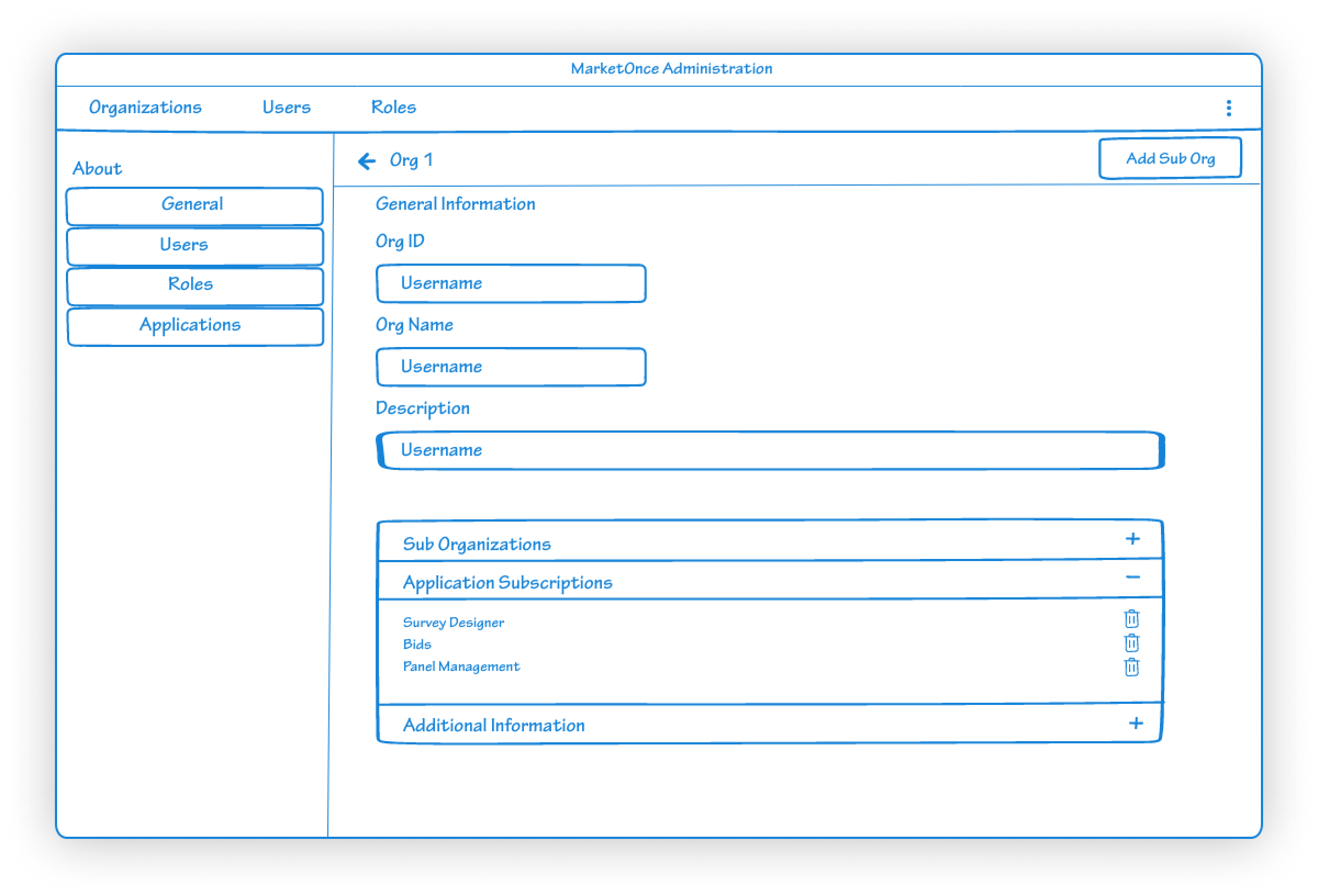
New organization context:
This new redesign of our org context now displayed the current organization the user in navigating through and an easier access to switch between organizations that are affiliated with the user.

Single user roles:
Display of all user roles specific to a single user. Addition of a new role and navigation to add new permission is also accessible through this page.

Edit user details information:
Cleaner display of all relevant information significant to the user. Navigation through organizations to find users is now easily displayed on the top left near the organization title so the user knows exactly where they are.
What’s Next?
Since I had an existing UI that was currently in build I was able to get a slight jump start in my design process. It’s a lot easier when you know what NOT to do so I will say executing the final redesign of this application went smoothly. I was glad with the outcome and felt that the clean interface including the speed and efficiency to complete user tasks allowed me to meet my most important design goals.
Since the design has been tested and revised it is ready to enter the development phase. During this process I will effectively communicate with the developers to help create guidelines and test the application myself to better assist the build and behavior of our identity manager.
Updates and revisions will be addressed based on their priority level.